1. Streamlined creating selections
One click is enough.
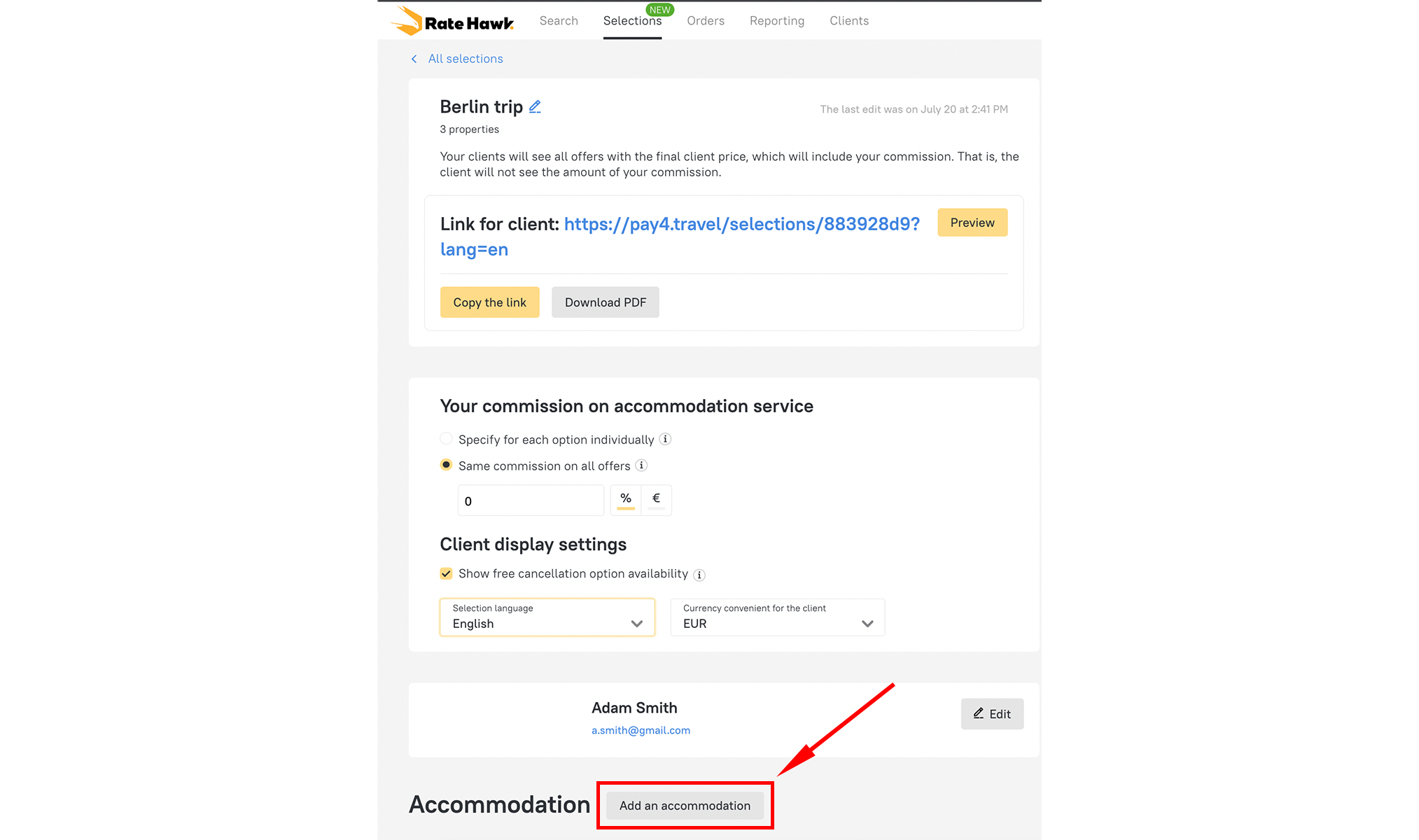
Just click ‘Create a Selection’. You can choose to use the auto-generated name or your own unique title. Now no need to do a lot of actions like create, open, and come up with a name.

Commission already included
In each selection commission is set by default from your profile – automatically. Best of all, you can simply change this commission or leave it as is on the selection. This helps to avoid situations when you forget to change the commission and the client receives a selection of hotels without extra charge.
2. Faster accommodation additions
Easier way to add hotels.
Previously after creating selections, you had to go to the hotel search page yourself.
Now it is easier! Just click the ‘Add an Accommodation’ button at the end of the selection list.
Now, you’re automatically re-routed to the search page to make your accommodation selections and bookings even faster.

3. Room images automatically added
Better visuals. Easier sales.
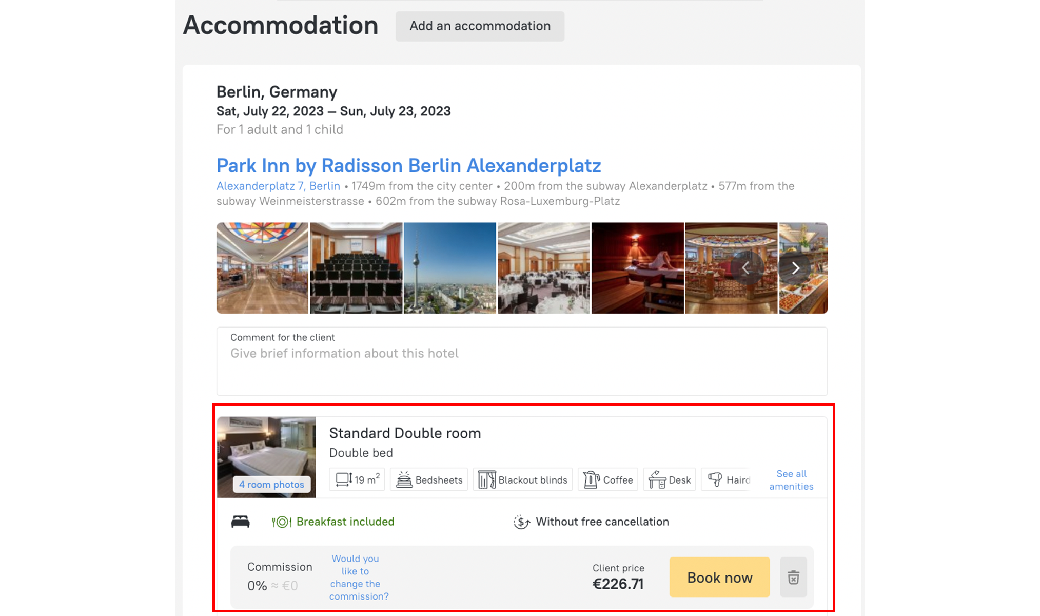
In addition to the usual imagery of the hotels (restaurants, reception etc.), we’ve also included photos of the rooms itself. This helps the clients to visualise themselves in the hotel and make a decision faster.

How it can help
There are situations when two rooms are suitable for a request in one hotel. Previously, they could only be distinguished by the name and price, making it difficult for the client to understand why he should pay more for the same thing. Now they can visually understand the price difference between a deluxe room and a standard room.
4. Links with context
Transparent communication
All links to clients are no longer just blue. To avoid confusion, each link sent via your dashboard includes an auto-generated description.
This saves you from having to type all the information and ensures that the client knows exactly what they’re clicking. It’s also an excellent feature to track your correspondence.
5. Wider hotel selection
Easy to navigate user-friendly files
It’s now even easier to show clients additional hotel options. Our user-friendly files allow you to add more hotel options and share a professionally designed folder to clients.
We’ve also expanded the number of options from 10 to 20.
We’re always improving! Just like the tourism industry, we’re constantly moving and growing.
We’ve got more updates coming soon. Be sure to stay connected with us and share your feedback so that we can keep on improving our systems – so that you can grow your business.


