Hotel Search Form
What has changed: the website now displays correctly on mobile devices.
Why: earlier, when you accessed the website from a phone or a tablet, it might not have adjusted to your screen size, which made the search for a hotel less convenient than from a computer. Now, whatever device you use, the search form is displayed correctly – it has become adaptive.
Hotel Search Page
What has changed: now we provide a choice of hotel display modes (map or list). Also, the hotel profile view has changed, and new filters have been added – you can now use them to choose the type of bed, meal plan, cancellation conditions, and also to find pet-friendly hotels. The “area of residence” filter is especially welcome: it will help narrow the selection of hotels by the client’s location of interest.
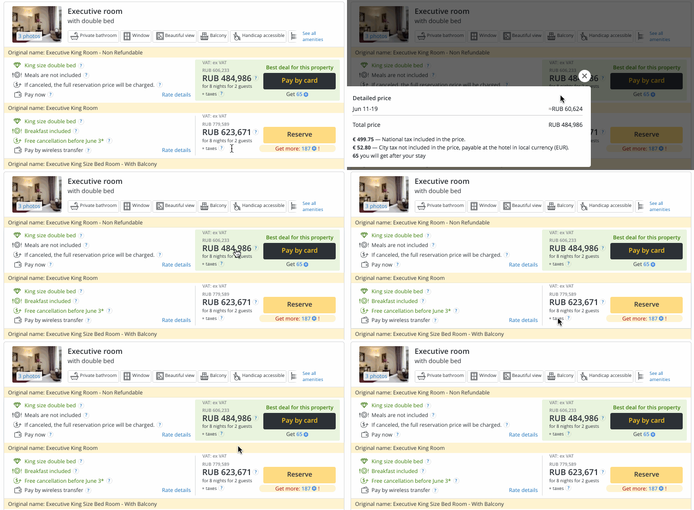
You can also view what’s included in the price using the Shift + R key combination on the search page, on the hotel card, and on the booking form.
Why: the page changes help to simplify and speed up the hotel search according to the specified parameters, as well as to adjust the page display to match your preference – on the map or listed.

Hotel Profile
What has changed: more information has appeared on the profile, including information on taxes: what tax is included in the price, and what tax the customers will have to pay on the spot. Similar hotels have been moved to the left of the page, while reviews and additional information are shown in collapsed form so as not to interfere with the search for hotel information. You can now view the hotel location in just one click.
Why: previously, the profile only displayed a photo and brief information about the hotel – it was not enough to figure out quickly whether the hotel would suit your client or not. Now, the hotel profile is more informative, and the information shown is structured. This will help to find hotels with the desired features more quickly and to make the right choice.

Booking form
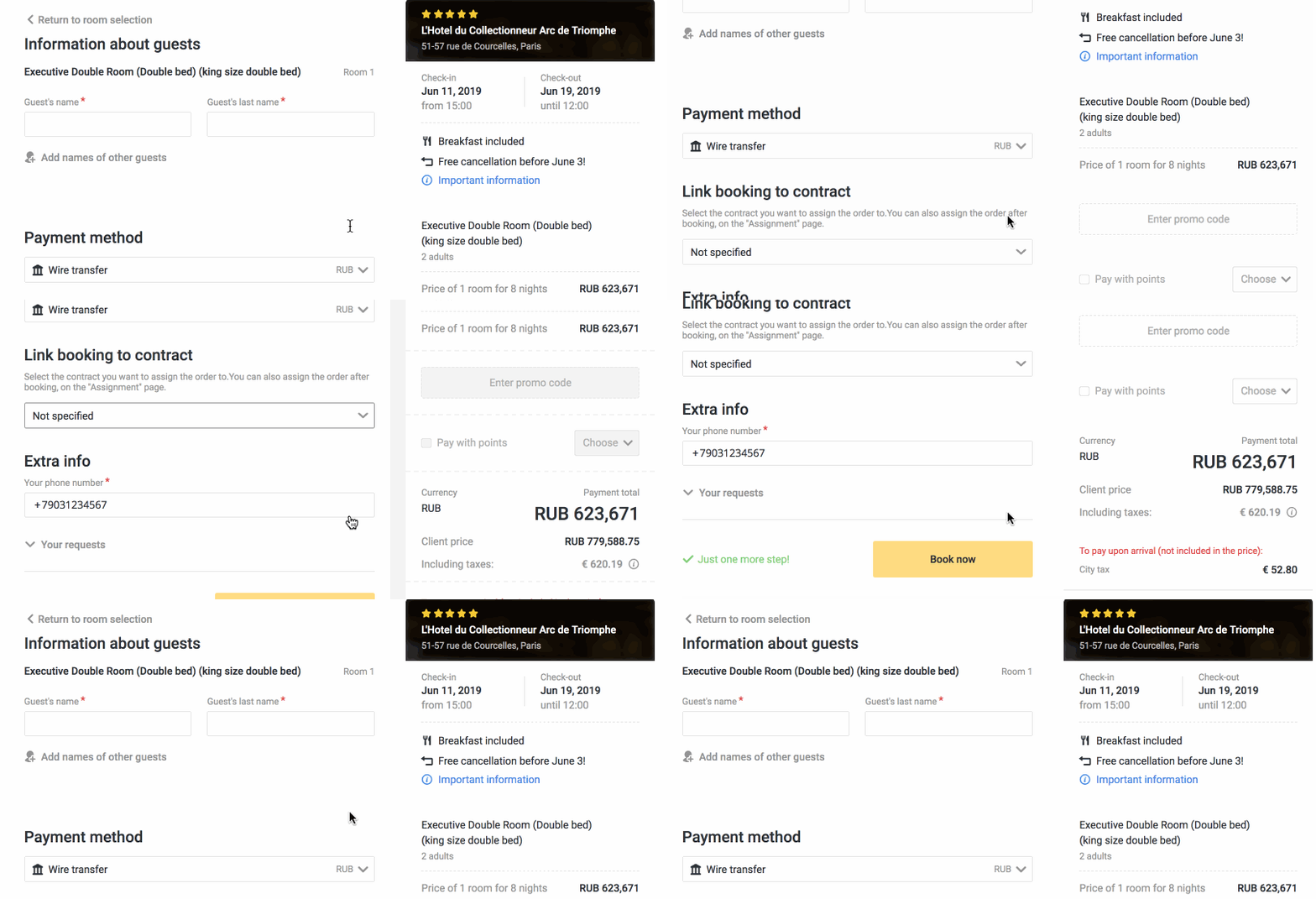
What has changed: we have removed unnecessary images and simplified the design.
Why: changes in the design, although seemingly insignificant at first glance, help to focus on the main points and avoid wasting your time on unnecessary information.

We stick to the “less is more” rule, and continue to simplify the pages. This not only facilitates navigating the site but also helps to save time finding a hotel. And yes, perfection has no limits: if you have any problems working with the site or have suggestions on how to improve it, feel free to write to your account manager or the RateHawk.com social network pages.


