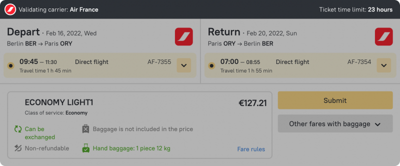
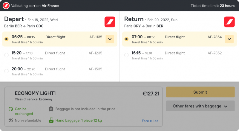
We have added the logo of the validating carrier and made the time limit more prominent
The top left corner of the page now displays the logo and name of the airline on whose headed paper the tickets will be issued.
The top right corner of the page now displays the time limit. You now see instantly how much time is left to pay for the tickets — for example, 30 minutes, 24 hours or several days.
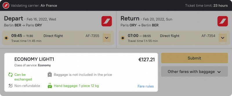
The rate details are now displayed constantly
In order to read the rate details, you used to have to move the cursor over the icon. Now the details are constantly displayed and included in a separate block — here the rate name and price are highlighted in large-sized font, and the seat class is also shown.
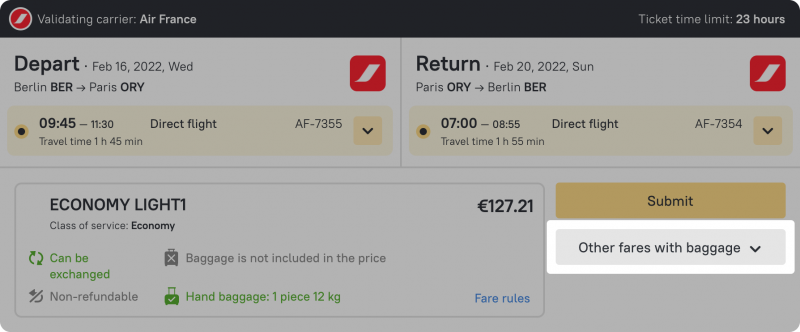
We have made the button with other rates prominent
If other rates are available for the given flight option you will see this easily and can switch to them in a single click. The required button is now located in the bottom right corner under the selection button.
We have laid out the flights in a convenient way
Previously the outbound and return flights were placed one on top of the other. To make it easier for you to select flights and compare all the details, we have placed them in a column. Thanks to this, the search page has become more compact: the flight options and rate details are all displayed on the same screen.
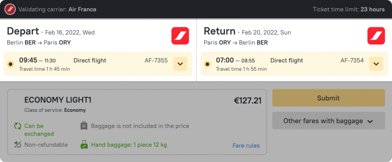
We have highlighted the selected flights in color
Selected flights are now highlighted on the search page with a wide yellow stripe, which means that it is virtually impossible to press the wrong button and thereby select the wrong option.
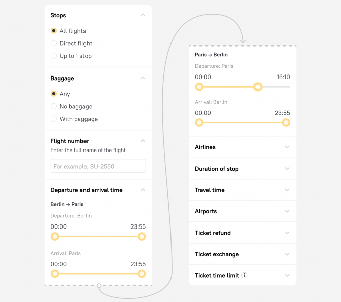
We have cleaned up the filters
We have retained all the required filters, but we have made them more understandable and placed them in a convenient order. Now you can select a comfortable time for your flight even faster, by excluding indirect flights, selecting options with luggage, and lots more.
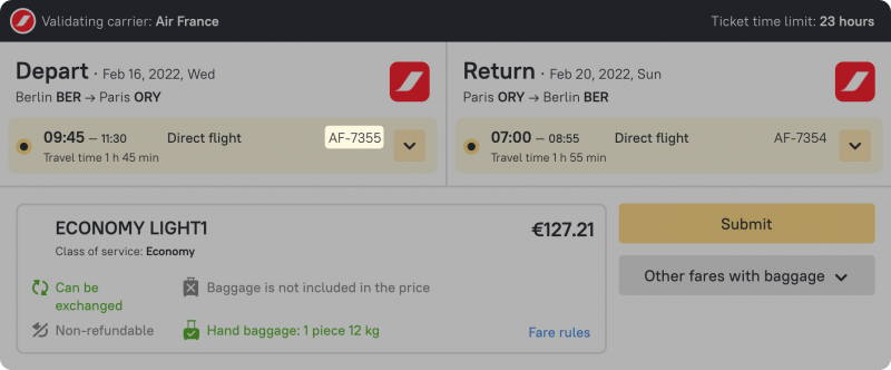
We have displayed the flight number for each option
Now you no longer have to open the journey details in order to find your flight number — it is shown on the page. As a reminder, you can also use the special Flight number filter.
We are sure that it is now even easier to find the optimal flight options! If you have any questions about booking air tickets, please contact your account manager.


